Advisee
A mutual fund investment platform, rebuilt around trust.
Mar 27, 2025- Client
- Advisee
- Services
- Brand system · UX/UI · Web build
- Year
- 2025
- SECTOR
- Wealth & Asset Management
- SURFACES
- Marketing site · Personas · Newsroom
01 — The ChallengeWhat we were handed
Advisee had the credentials of an institution and the presence of a startup.
Family offices, NRIs and business owners all arrived at the same undifferentiated page. The work was to build one identity strong enough to carry four audiences, then design the surfaces that prove competence in the first five seconds — numbers, people, and a route to an advisor.
02 — Design System
The kit of parts
The decisions taken before a single screen was drawn. Everything after this is assembly.
Logo system
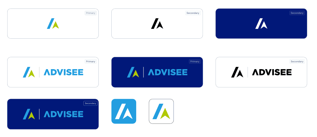
One mark, eight sanctioned lockups — so the brand survives a navy header, a white deck and a 32px favicon.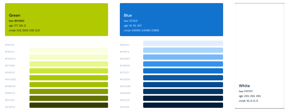
Colour
Blue #1273CF carries authority; the green is reserved for growth moments. Nine steps each, so contrast never gets negotiated.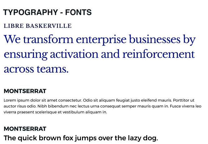
Typography
Libre Baskerville for the claim, Montserrat for everything that has to be read. Serif appears only where we want a pause.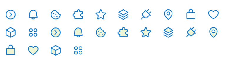
Iconography
A single stroke weight across the set, drawn to sit at 24px in dense advisory content.03 — What shipped
One screen, one decision
01 / 06
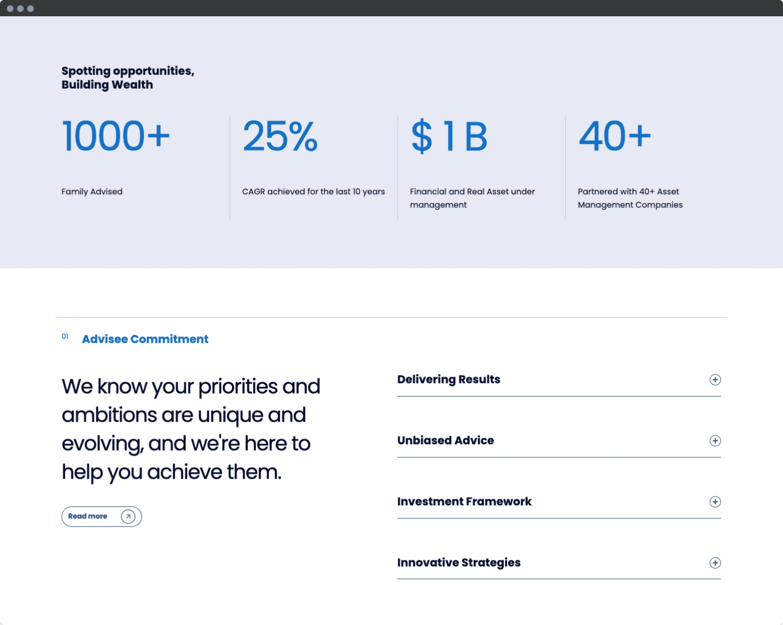
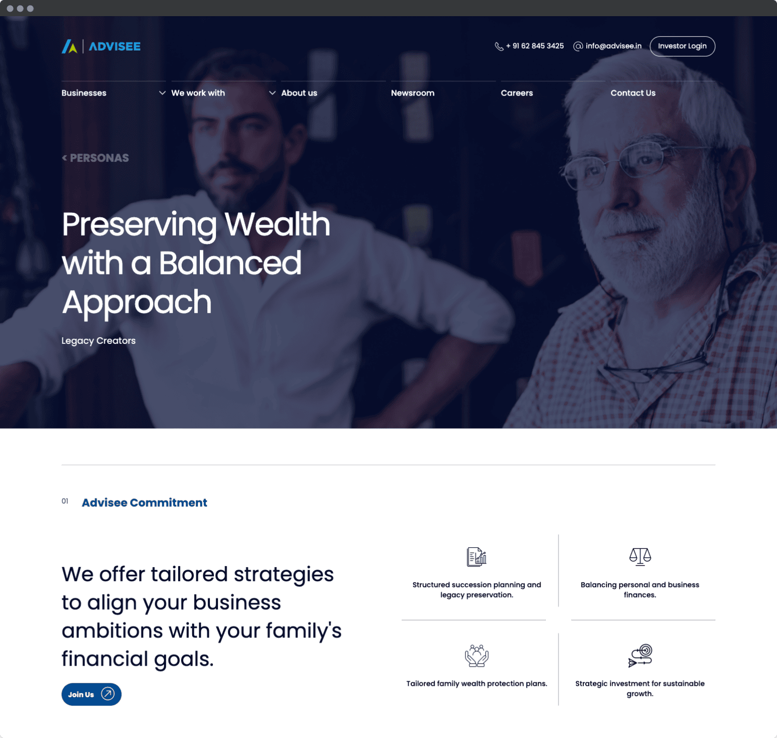
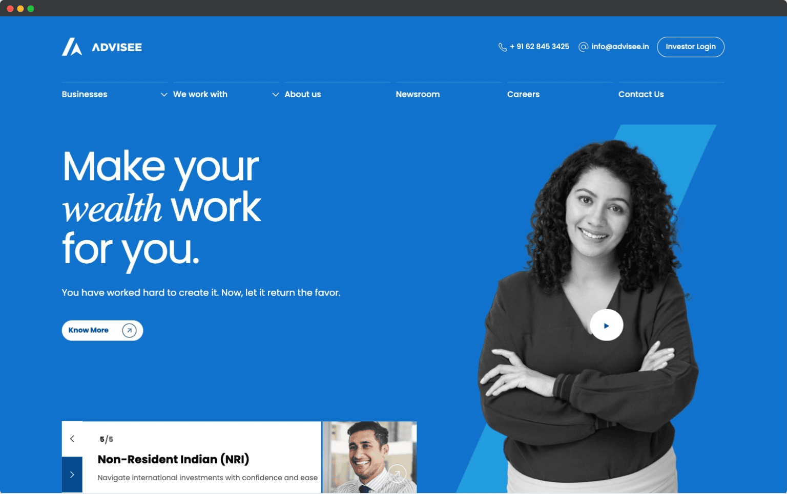
HOMEPAGEA claim, a face, and a way inThe hero carries one promise and one advisor. The persona selector sits below the fold line so each audience self-sorts within a scroll.
PROOF BANDFour numbers, no charts1000+ families, 25% CAGR, $1B under management, 40+ partners. Stated once, large, then never repeated — repetition reads as insecurity.
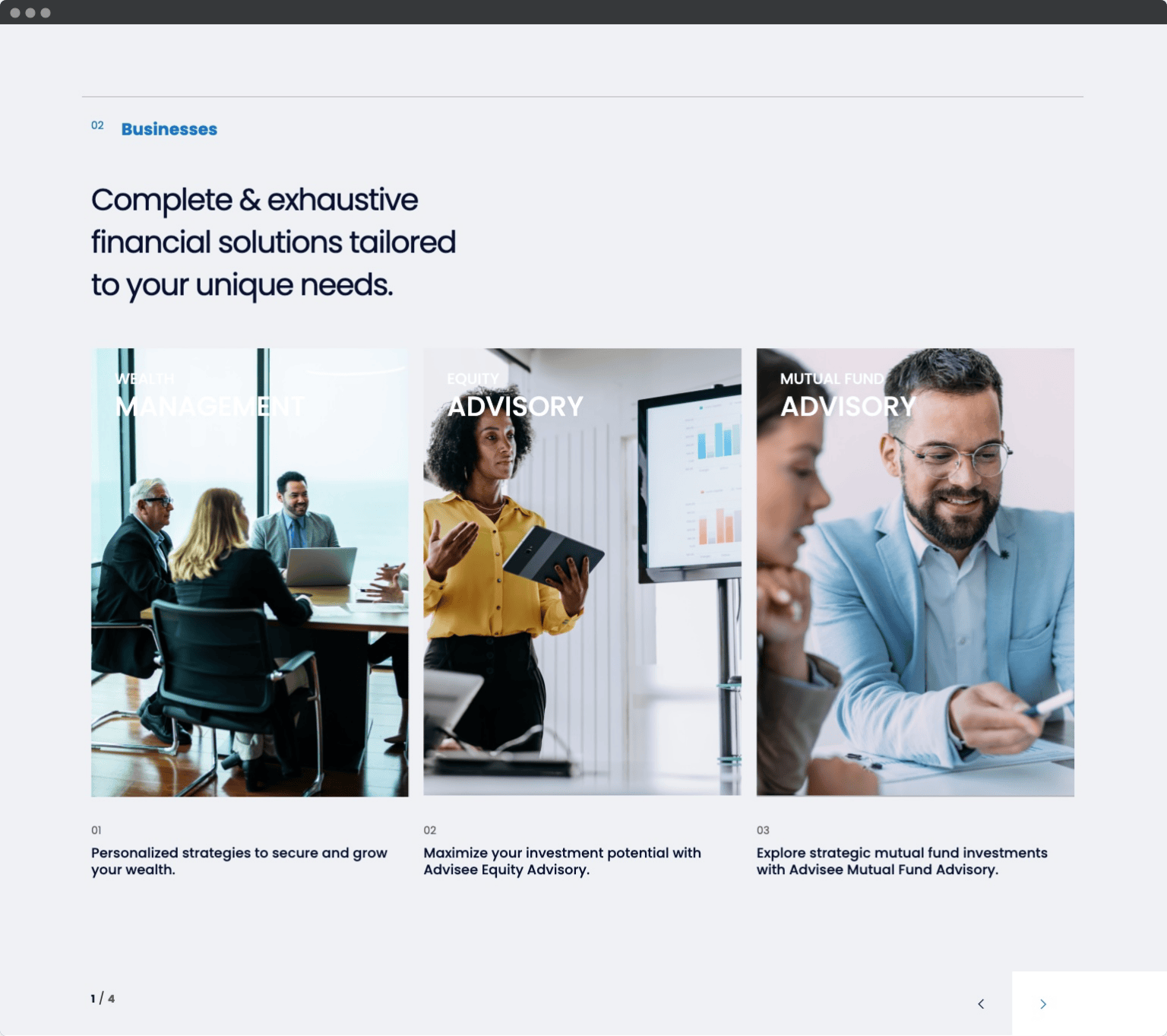
BUSINESSESServices shown as people, not tilesThree portrait plates instead of icon cards. Advisory is bought from humans, so the imagery does the reassurance and the caption does the detail.
PERSONASA dedicated page per audienceLegacy creators get succession language and their own hero. Same components, different weighting — which is what makes four journeys affordable.
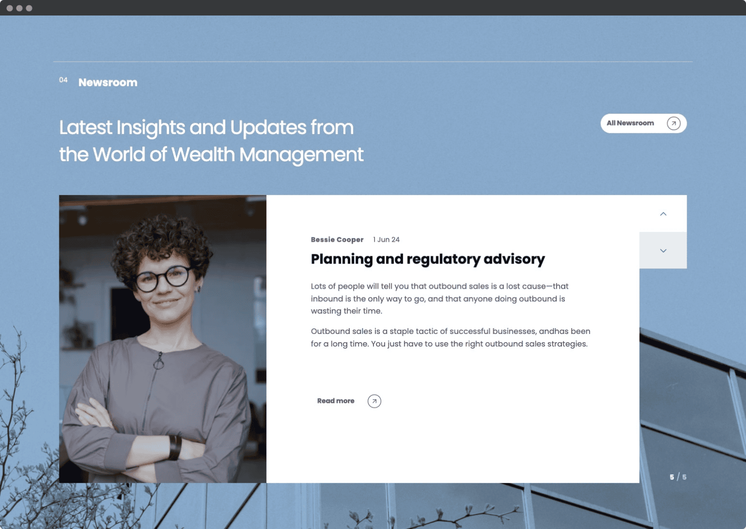
NEWSROOMInsight as an expandable stackArticles open in place against a tinted plate. Publishing cadence stays visible without a wall of cards.
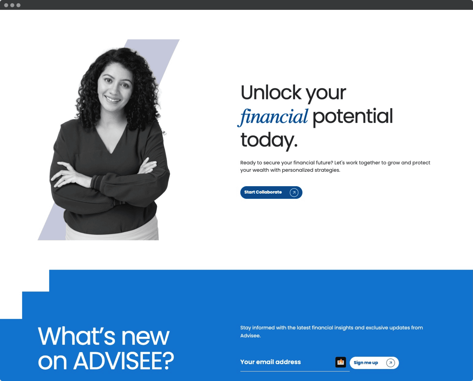
CONVERSIONOne ask at the endStart a conversation, or take the newsletter. The two asks are separated by colour so neither competes.
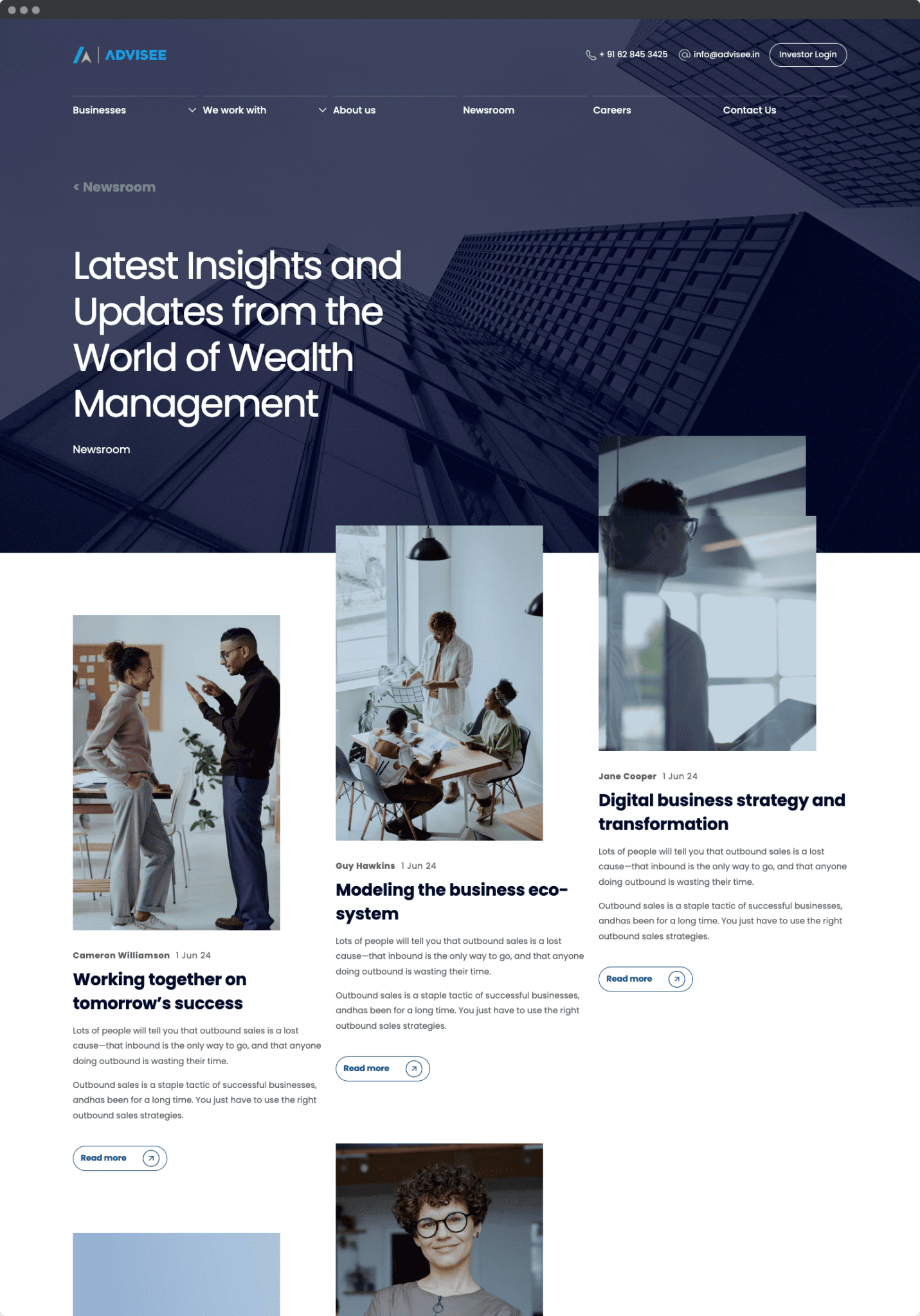
Full pageThe newsroom index, end to endEditorial layout that stays legible from three posts to three hundred: a staggered column rhythm, author and date before the headline, and image crops that break the grid just enough to keep the page moving. Scroll it.
04 — How it runsTech & architecture
A component library the client can extend without a designer in the room.
DesignFigma library — tokens for colour, type and spacing, components mapped 1:1 to build
BuildWordPress with a component-driven page builder, so marketing ships pages unaided
Content modelPersonas, services and newsroom as separate types — each reuses the same blocks
HandoffBrand guidelines, logo pack, icon set and a page-assembly playbook
05 — Outcomes
One system, four audiences, no redesign needed to add the fifth.
4Persona journeys running on one component set
8Sanctioned logo lockups replacing ad-hoc usage
1BDollars under management, stated once and clearly
0Designer hours needed to publish a new page
Where it goes nextInvestor login, portfolio reporting and a regional language layer are already drawn against the same components.
Start a project like thisNext caseGymBait.AIAI training that keeps people coming back.
Open case